NOTE: A NEW STATE FLAG HAS BEEN CHOSEN
THIS SITE IS FOR ARCHIVAL PURPOSES ONLY
AN EARLY MINNESOTA FLAG REDESIGN
THE 1989 EFFORT


Grant Moos
"New Wave: Two state-flag enthusiasts are running a new design up the flagpole"
Minnesota Monthly, November 1989, p. 23-24.
In the pantheon of bright and flashy flags, the Minnesota flag is all tans and beiges, say Father Bill Becker and tax accountant Lee Herold, two amateur vexillologists (those who study flags) from Rochester. They are proposing to redesign the state flag, whose current design and color scheme is nearly identical to the flags from 13 other states.
Becker says he and another Minnesotan, while studying in Rome to become priests, felt a need to express their roots. "It was just hard to become endeared to the Minnesota flag," he says. So he began sketching new designs.
One of his earliest designs depicted the heads of two loons. He scrubbed it, however, because it was ridiculed by people who suggested that changing the flag was akin to beheading a loon or calling Paul Bunyan a sissy.
House Speaker Bob Vanasek (DFL-New Prague) referred to the proposed design, which was unveiled at the state capitol last spring, as "a couple of dead ducks or whatever they are." St. Paul Pioneer Press Dispatch columnist Joe Soucheray wrote, "It looks like the official state flag of Sesame Street." And Pioneer Press Dispatch columnist Nick Coleman called it "a silly cartoon with silly cartoon symbols. It isn't worthy of flying over Minnesota."
State legislator Eileen Tompkins (IR-Apple Valley) didn't hold back when she first heard the proposal, either. "To me it's ridiculous, she said. "I'm a fifth-generation Minnesotan. I certainly resent the fact that anybody wants to change it."
Becker and Herold say they weren't surprised by the reception. They expected even worse and have been amazed by how warmly others have embraced the idea. They intend to press the Minnesota Legislature to make the change by 1993, the present flag's centennial.
The Star Tribune, The Free Press of Mankato, and the Worthington Daily Globe have all editorialized about the state flag needing a makeover. And when Becker and Herold first appeared before state lawmakers, their proposal was greeted with a smattering of applause.
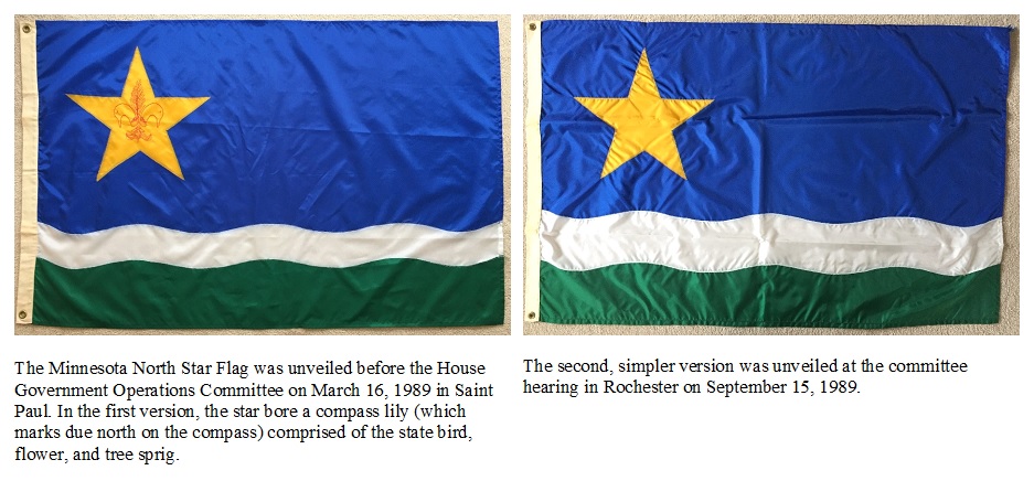
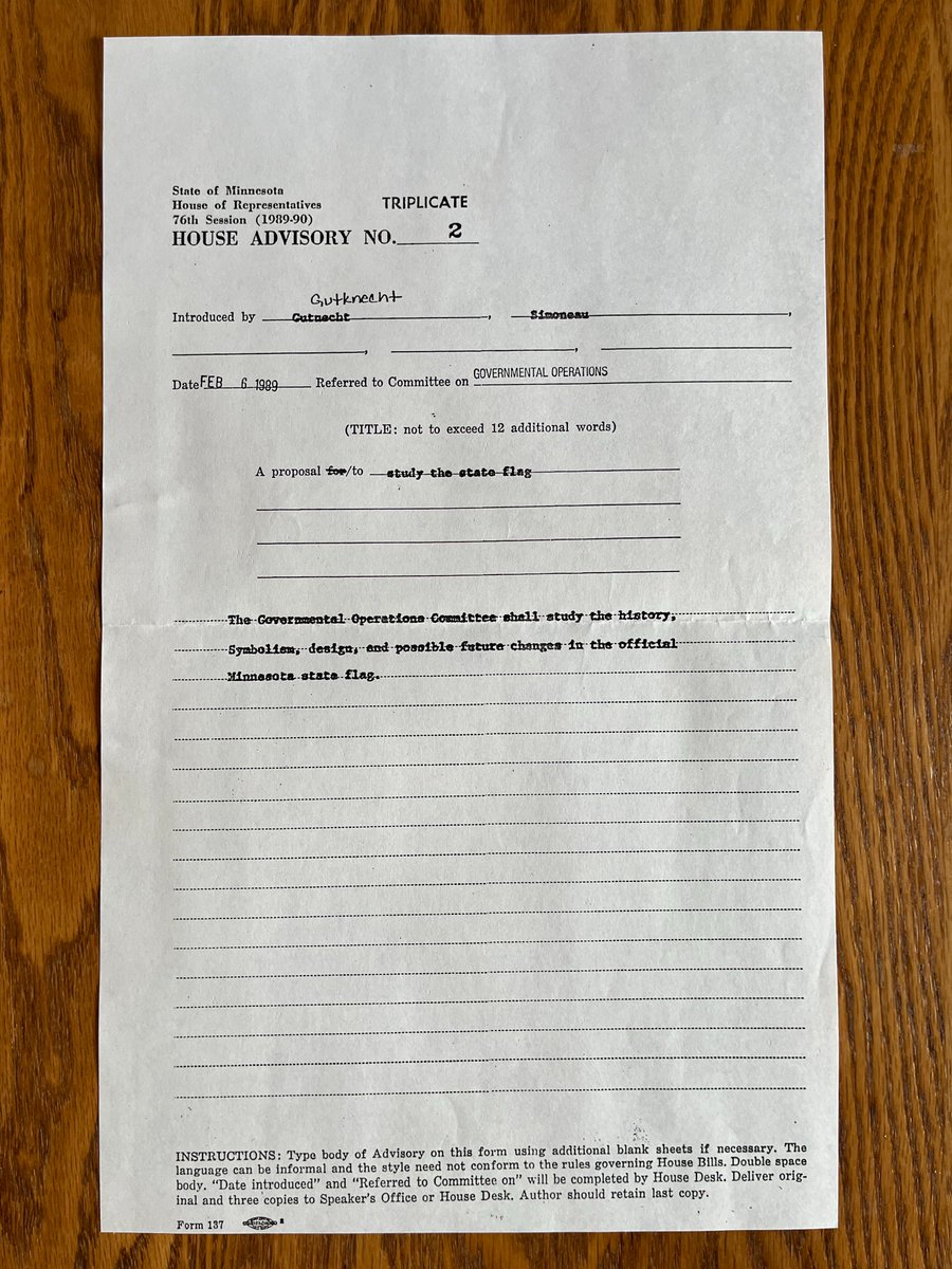
After toying with a variety of designs, Becker settled on the "Star and the Waves," which, like Canada's symbol, is rooted in the land. Becker's design depicts the Star of the North in gold, symbolizing the North Star state. At the top is a wide blue band symbolizing the sky and water. A narrow, white wavy band through the middle represents snow. And a green band at the bottom symbolizes forests and fields.
That bold design, argue Becker and Herold, would put Minnesota's flag in the same league with the flags of Alaska and Arizona, which are among the nation's flashiest. They also believe the new design would coalesce and articulate the feelings Minnesotans have about their state.
"The more effective a sign, the more effective a symbol will become, says Becker, whose focus of study in the seminary was semiotics in religious life.
Traditional symbols in Minnesota or anywhere else however, die hard.
The distinctive red and white maple leaf flag of Canada wasn't adopted until 1965 decades after a change in that flag was first proposed. And an unsuccessful proposal to change the Montana flag dragged on for years before failing in the early 1970s.
But both men are confident that if people take a critical look at the current flag, they will be won over by the new design.
For those who can't remember, and there are many who can't, the current flag depicts an Indian on horseback, a pioneer farmer, a setting sun, St. Anthony Falls, and three dates: 1819, when Fort Snelling was established; 1858, when Minnesota became a state; and 1893, when the flag was adopted. Hoist the flag up a pole and the writing and pictorial scenes may as well be hieroglyphics, claim Becker and Herold.
"Though long-standing, the traditions behind this flag are generally weak and uninspiring, especially when compared to our other state symbols (e.g., the loon)," wrote Becker in a pamphlet titled 10 Reasons for an Updated Minnesota Flag.
Originally the state flag was thought to be based on a Civil War flag from a Minnesota regiment. But the design was simply a hastily conceived entry in the 1893 World's Fair held in Chicago. Amelia Hyde Center, the wife of a prominent Minneapolis businessman, won $15 for the design. That flag depicted the state seal on a white background with a blue panel on the reverse side.
Because the two-sided flag was expensive to make, state lawmakers in 1957 opted for a blue background on both sides to make the flag cheaper. In response to protests from American Indians, the flag was changed again in 1983 to show the Indian riding toward the settler instead of fleeing into the sunset.
There is evidence that the state seal, upon which the flag is based, is somewhat illegitimate. The bill written to establish the seal was never signed by the governor in 1858, although it was given official sanction three years later. The legislature had approved a completely different design, one of Indians and whites living in harmony a concept that then-Governor Henry Sibley felt was untenable. Sibley has been accused by historians of "mislaying" the design that lawmakers approved and replacing it with the territorial seal he helped design. To this day Sibley's seal remains the basic design.
Whitney Smith, director of the Flag Research Center in Winchester, Massachusetts, agrees that the Minnesota flag design is poor. "If the same kind of attention had been paid years ago to the state flag, Minnesota would not today have the mediocre design and the many problems associated with its like," he wrote in a letter to Becker.
Becker and Herold still have a lot of convincing to do. There have been only pockets of support among lawmakers; most have been reluctant to even consider the subject. Vanasek put the kibosh on the proposal in the 1989 legislative session.
Representative Gil Gutknecht (IR-Rochester) hopes a committee of the legislature will at least study the proposal and then recommend whether the flag should be changed. He concedes that the proposal does appear outlandish at first glance.
"When [Becker] first called me, I said, 'Why are you bothering me? I've got enough things to do.' But the more I thought about it, I reached the conclusion that it's a serious idea that deserves serious attention."
View pamphlets from the Sept. 1989 hearing here View more media coverage from 1989 here