NOTE: A NEW STATE FLAG HAS BEEN CHOSEN
THIS SITE IS FOR ARCHIVAL PURPOSES ONLY
AN EARLY MINNESOTA FLAG REDESIGN

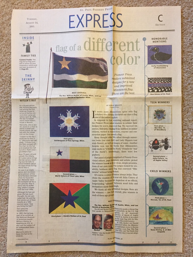
"Flag of a different color"
By Molly Millett
St. Paul Pioneer Press (Tuesday, August 14, 2001)
It seems many Minnesotans agree with flag scholars who recently declared our state's flag one of the nation's ugliest.
In response to that troubling national report, the Pioneer Press asked readers to submit their designs for a new, improved flag. We received 154 entries. Entrants, ranging from toddlers to senior citizens, worked in watercolors, crayons and construction paper. One sewed a flag.
Many thought alike: We sifted through numerous loons (our state bird) and Lady Slippers (our state flower), as well as images of water. Another favorite icon was the North Star (Minnesota's state motto is "L'Etoile Du Nord," French for "star of the North"). Interestingly, there were few gophers.
Our panel of judges, comprised of Pioneer Press visual editors, page designers and artists, picked the winners based on their clean, simple presentations of our state icons. The judges looked for creativity, boldness, and a flag that conveyed "Minnesota" without being cliched.
Of course, a sense of humor always helps. They chose the creation of 14-year-old Julia Cistera of Apple Valley because her depiction of an official, longstanding "alliance" between wood ticks and mosquitoes made them laugh.
We thank all who submitted designs. Here are the winners – one best overall, plus winners in each of three age groups.
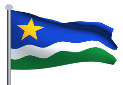
BEST OVERALL
The Rev. William Becker of Austin, Minn., and Lee Herold of Rochester, Minn.
Herold and Becker believe Minnesota needs a vibrant flag that speaks to Minnesotans as powerfully as the U.S. flag speaks to all Americans (Becker, of Queen of Angels Church in Austin, is an expert on the state flag with the Minnesota Historical Society).
In 1989, Becker and Herold appeared before the Minnesota Legislature twice to discuss creating a new flag. This flag, what they call "the North Star banner," was the design they presented. But it was not adopted by the state.
Now, the men hope their ode to Minnesota will receive renewed attention. They say their flag has multiple meanings: the North Star recalls the state motto, adopted by pioneers; gold is for our state's natural wealth; blue is for our lakes and rivers; the waves illustrate the Indian name "minisota' (meaning sky-tinted water) and the "land of 10,000 lakes"; white is for our winter; green is for our farmland and forests.

ADULT WINNERS
First place – Sid Berquam of Pine Springs, Minn.
"Mention Minnesota and the first thing that comes to mind is cold winters. Therefore, the snowflake. But at the center of it all, we
maintain a sunny, vibrant outlook."
Second place – Merle Sykora of Clear Lake, Minn., professor emeritus of art from St. Cloud State University.
"In my redesign, I paid tribute to our current state flag with its Minnesota state seal containing the motto "L'Etoile Du Nord,' by
placing a star in the upper left corner of the flag. In Native American tradition, there are four colors used to represent the four directions:
white, yellow, red and black. White is the color associated with the north, so the blue (standing for fidelity) star was placed on the white
field, thus depicting the star of the north. These four colors represent the four directions, and are the traditional colors associated with various races. Bright colors attract attention while representing our ethnic diversity and historic traditions."
Third place – Kendra Nielsen of St. Paul
"I used the colors red, black, green, yellow and blue because they remind me of the Olympic flag. Just like the Olympics is a coming
together of nations and cultures, so, too, is Minnesota. The blue star in the center represents the long-standing motto "L'Etoile Du Nord,' and I choose blue to remind us of the mighty Mississippi and all of the lakes we hold dear
to our hearts."
HONORABLE MENTIONS
Kelly Frankenberg of Shoreview
"My flag is our state bird, the loon, on a blue background that symbolizes our lakes. The yellow star in the loon's eye represents the
North Star (and we are the North Star State). We are also the source of the Mississippi River, therefore I placed it on the flag, and it flows through the loon."
Ron Struss of St. Paul
Struss breaks down the design symbolism of his flag:
Mottled pattern: The loon, symbol of Minnesota's northern lakes and forests.
Black: Minnesota's prairie soils and agriculture.
White: Minnesota's northern climate.
Blue: Minnesota's lakes and rivers.
Gray: Minnesota's centers of commerce, industry and mining.
Red: Lifeblood of Minnesota citizens.
TEEN WINNERS
First place – Wei Wei, 13, of Woodbury
"In my flag design, I have most of Minnesota's state symbols. The loon in my flag represents the power and freedom of Minnesota. The Norway Pine trees in the background represent how strong Minnesota is as a state, because those trees stand tall and above everything else. The Monarch butterflies and Lady Slipper flowers represent the beauty and variety found in Minnesota."
Second place – Julia Cistera, 14, of Apple Valley
"On the left is a tick, and on the right is a mosquito. The white background represents snow."
CHILD WINNERS
First place – Kia Lee, 12, of St. Paul
Kia created this Lady Slipper flag during a Dayton's Bluff Elementary School summer program. "I was looking in a book on Minnesota, and I liked the bright color of the Lady Slipper."
Second place – Tessa Hosley, 9, of Minneapolis
Tessa designed this lake scene during a Blaisdell YMCA summer adventure program in Minneapolis. "Some people really like sunsets, so I pretty much used all the colors you would find in a sunset. Also, Minnesota has so many lakes, so that's why I had a lake."
