NOTE: A NEW STATE FLAG HAS BEEN CHOSEN
THIS SITE IS FOR ARCHIVAL PURPOSES ONLY
AN EARLY MINNESOTA FLAG REDESIGN


TEN PROBLEMS WITH ITS DESIGN
1) You can't see its details from afar: everything is invisible because the state seal is too detailed.
2) Few can remember its details: they're too complicated to be recalled or sketched.
3) It could be confused for twenty other state flags: they're all blue with insignia.
4) Everything is backwards on the flag's reverse: pictures, dates, & slogans ("atosenniM").
5) Its design is not versatile: the flag can't be reproduced well on miniature items or in the largest flag sizes; and it appears crooked when hung vertically.
6) It uses tiny pictures and dates: it should instead use bold color patterns and emblems, like those found in good flag designs.
7) It repeats itself: the North Star appears twice (the motto and topmost star); statehood twice ("1858" and 19 stars); and it is even stamped with the name "Minnesota" (which shouldn't be necessary if the design is a good one).
8) Its symbols have been controversial: the seal originally symbolized the white man's takeover of the frontier from the Indian.
9) It is timebound to the 19th century: its tradition is fading, not growing.
10) A seal is meant for documents, not flags: the seal's crowded details can only be seen up-close, because it was designed like a portrait.
FLAGS AND PORTRAITS The Minnesota flag resembles a "flying portrait." Unfortunately, portraits are invisible from afar, whereas flags are supposed to be visible at great distances.
There are two reasons why the flag resembles a portrait. First, the flag is based on the state seal, which itself was created from a small watercolor by artist Captain Seth Eastman. Second, the original flag was designed for up-close viewing, like a portrait. It was created as a promotional tool for the state and was first displayed on the stage of the state pavilion at the 1893 Chicago World's Fair (above, at right).
Although the design was not suited for general display, the legislature made it the "official state flag." The double-sided flag, however, was bulky and expensive, frayed easily in the wind, and was rarely used. In 1957 the legislature tried to simplify its basic design, ignoring an alternative proposal. Nevertheless, it remains a "flying portrait" which is invisible from afar, poorly known by the general public, and rarely used, in comparison to better designs in other states.
The first State Flag could be restored as a special "Ceremonial Standard" for occasions of high ceremony, if a completely new State Flag became official. Or one of its predecessor battle flags could be retained to honor Minnesota's commitment to the Union (such as the 1st Minnesota Regiment that fought at Gettysburg). For more on the history of the flag and seal, click here.

ABOUT THE FLAG The first state flag (above) was adopted in 1893. It was similar to the current version, but with a white field, and the design more spread out. The stars were gold, like those in contemporary U.S. regimental colors, and formed a "Great Star" pattern familiar to the era.
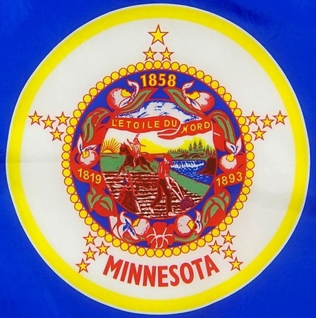
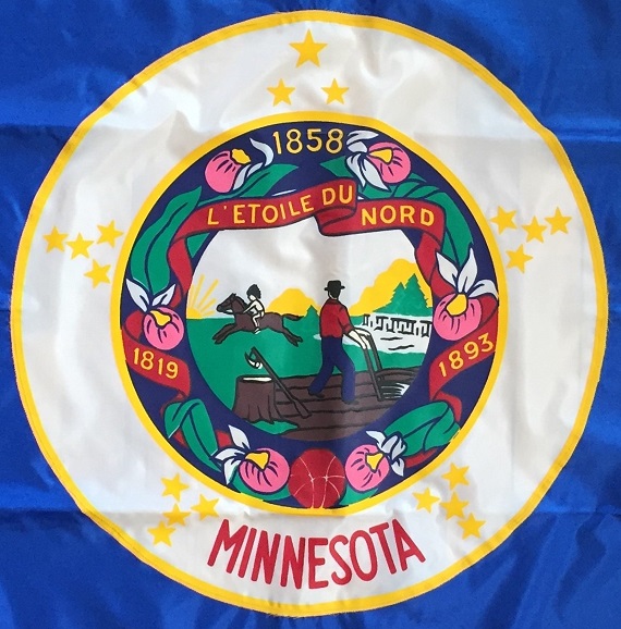
The current flag (at left & below) was adopted in 1957, and was intended to streamline the design of the original flag. It bears the state seal (revised in 1983), which is surrounded by the state flower and motto, a North Star, 19 stars (representing Minnesota as the 19th state after the original 13), and the dates 1893 (recalling the first state flag), 1858 (statehood), and 1819 (when Fort Snelling was founded).
TWO RECENT VERSIONS
The flag above uses the version of the seal in force since 1983.
The flag below uses the version of the seal in force before 1983.

HOME PAGE DESIGN NEWS OLD FLAG HISTORY F.A.Q. HELP OUT MERCH PROPOSAL
Poor Flags Good Flags Flies Poorly Flies Well Versatility New Flags Alternate Flags
State Seal Battle Flags 1893 Flag Anderson Effort 1989 Effort Oliver Effort